This is a quick dump to get this out there, further discussion and documentation to be provided over time.
Google Trends doesn’t have a real public API; it’s heavily rate limited and so it’s hard to get even moderate amounts of data, and large amounts are right out. I worked with pytrends and scripted some delays and automation for downloading larger amounts of trend data for lists of search terms.
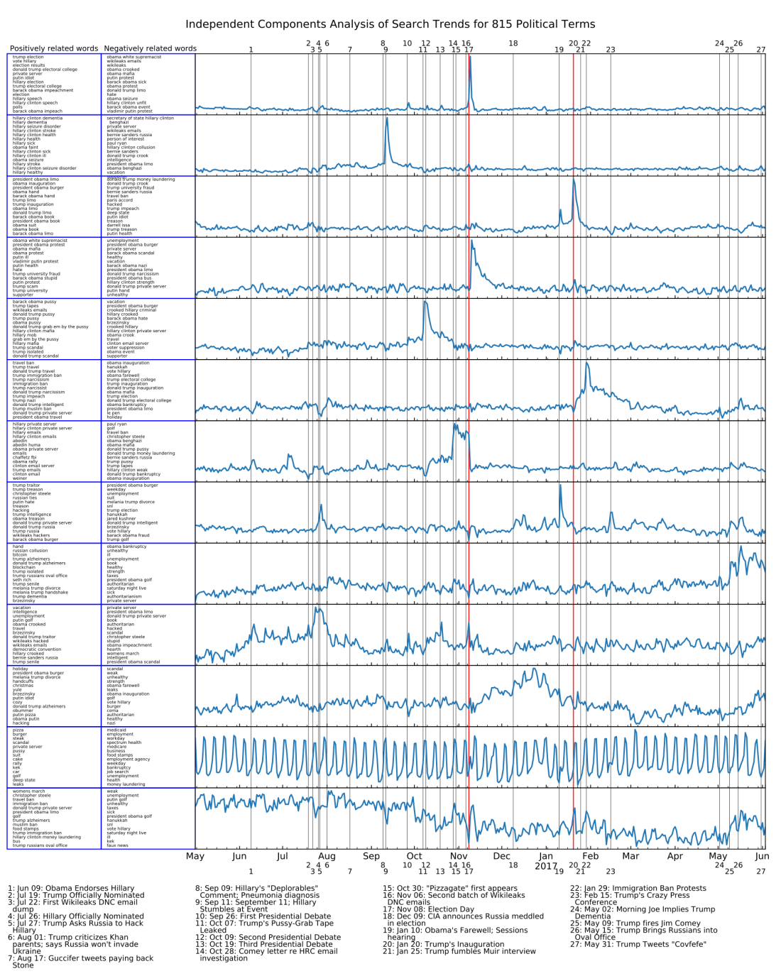
I used this to download just over a year’s worth of day-by-day trend data for (currently) 815 search terms, mostly related to current political events. Then I subjected this matrix to Independent Component Analysis using Scikit-learn, which turns out to do a great job of separating out components with clear meaning on the events timeline. The components are displayed on a stacked plot with key political events labeled on the timeline. Some of the political events I entered a priori because they were obvious (like the election itself), and then some of them were entered after I researched archived news corresponding to peaks I saw in the plots. Note that many of the events in the latter categories were things that I wasn’t thinking about at all when I put together the list of search terms, but the ICA on the large set of terms brings out those peaks automatically.
Here’s an example plot with 13 components (choosing number of components for ICA is more art than science, 13 seemed to work well but other numbers did too):
There are a few other interesting trends graphs I’ve seen online. Here I’ve placed two big ones overlaid on that plot, for comparison of timelines. The first one is the plot of Alfa bank DNS server logs, which may or may not have something to do with anything nefarious. The second one is from Echelon Insights‘ annual promotional “year in news” article. Of course I don’t know their exact methodology (the point is that they’re selling their service, after all) but it’s likely that the trends displayed here are based on starting with the keywords labeling the peaks, rather than a component analysis of some sort. I would love to hear from someone who knows more.

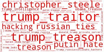
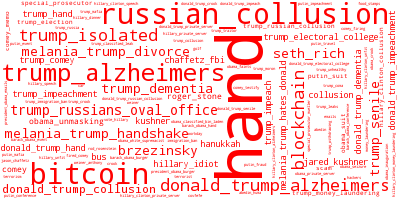
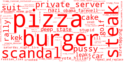
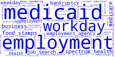
The columns at the left are the top 15 terms, and bottom 15 terms, associated with that component. The positively associated search terms trend much more frequently when you see a positive spike in the associated component. The negatively associated search terms trend much more frequently when you see a negative spike in the component, or when the overall value of the component is low. The code automatically detects the spikes and rectifies the signal (ICA outputs are unpredictably, if not arbitrarily, scaled, so some ordering and rectifying are helpful) so the positively associated terms are usually more meaningful, but there are some interesting trends in the negative words too.
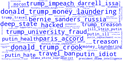
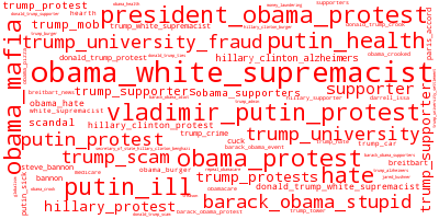
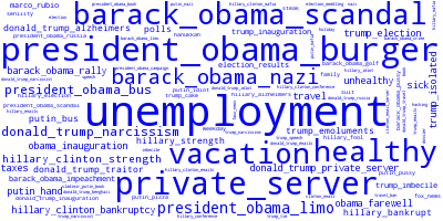
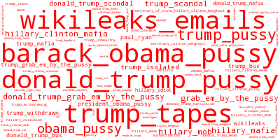
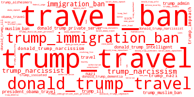
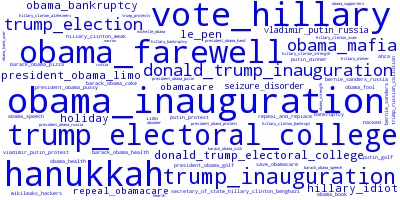
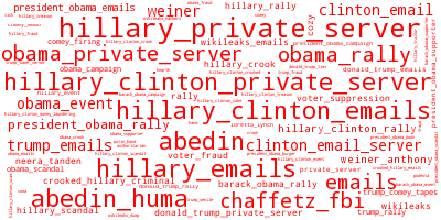
To improve visualization and insight related to the search terms, the code also generates word clouds of the top positively and negatively associated terms. Here they are in the same order as on the left side of the plot.


Although this is preliminary, I can make a few observations here.
- The burst in Alfa Bank server activity is nicely bracketed by two events: Trump claiming Russia won’t go into Ukraine (also, Trump publicly asking Russia to hack Hillary’s email); and then Guccifer 2.0 tweeting to Roger Stone “paying u back”.
- This article by Roger Sollenberger on how SEO is used for political influence describes gaming Google search results with a lot of fake posts. It uses the specific example of how the Seth Rich story started to get pushed after Trump brought alleged Russian spies into the Oval Office. In component 9 (sorry they’re not labeled, you’ll have to count from the top) you can see a predominance of terms related to both “trump_russians_oval_office” and “seth_rich”, which is consistent with that article’s demonstration.
- Trump’s “grab ’em by the pussy” tape leaked on October 11. Shortly afterwards, a massive amount of anti-Hillary trends started and didn’t let up until the election. They dropped off almost immediately after the election.
- The stuff glommed together as “wikileaks/hacking” in the Echelon graph is not completely clearly separated out in the components. Below, you can see what it looks like when I specified 15 components instead of 13. The Wikileaks email trend is clearer there, in component 10. Maybe I should have used that one as my main example instead of the 13 components.
- In case it isn’t obvious, the component number 12 (13 in the 15-component plot below) represents the strong weekly periodicity in Google search trends due to the work week.

Please consider this a preliminary post, I wanted to get these tools and data out there. You can access all the code and data at my GitHub profile here. (As of this writing, 2017 June 6, I haven’t added documentation yet, and I probably won’t have time to for a few weeks. Sorry!)
Here’s pdf versions of the big images above:
icacomponents13, icacomponents13_annotated, icacomponents15
To do:
- Stitch the word clouds and component timelines together into a single easy-to-view output
- Label components
- Single-word search terms are more frequent than multi-word ones. Consider ways to normalize this.
- Look into ways to integrate this with Reddit data from @conspirator0
